Examining Inbound, Outbound, and Internal AWS EC2 Data Transfer Costs Using CUR & Cost Explorer
Amazon Web Services (AWS) offers a vast array of services designed to help businesses store, process, and transfer data. While these services are certainly capable of handling data magnitudes of petabytes and more, tracking and understanding cost and usage metrics can be challenging. How can I find this data in Cost and Usage Reports (CUR)? What filters should you use in Cost Explorer? Furthermore, AWS’s pricing models for data transfers involving EC2 instances can be particularly complex and overwhelming.
We don’t want anything on your next EC2 bill to surprise you. And we certainly don’t want you paying an arm and a leg for EC2 data transfers because you didn’t understand AWS’s pricing models. That’s why in this article, we’ll talk about inbound, outbound, and internal AWS EC2 data transfer costs, and how you can use Cost Explorer and CUR to visualize these costs. Ultimately, our goal in this guide is to help you realize your EC2 data transfer spend and identify opportunities for cost optimization through graphs.
Quick Refresher: AWS Data Transfer Costs
Recall that AWS data transfer costs can be categorized into three different types. Each type of data transfer shows up differently in your CUR, meaning they have a different value for the lineItem/UsageType column.
Inbound Data Transfers
AWS typically doesn’t charge for inbound data transfers from the Internet. That’s right–inbound data transfers are free! This holds true for data transfers into EC2 instances, so you shouldn’t see any associated costs in Cost Explorer or CUR. However, inbound data transfers still show up as line items in the CUR with the following value for lineItem/UsageType:
-AWS-In-Bytes
For example, for data transferred into US East (Ohio) from the Internet, you should see the value USE2-AWS-In-Bytes. For this line item, look under the lineItem/UsageAmount column to determine the data transfer volume.
Outbound Data Transfers
AWS typically does charge for outbound data transfers to the Internet. For EC2 instances, costs depend on the region the data was in before the transfer, as well as the volume of data transferred. You should see line items in your CUR with the following value for lineItem/UsageType:
-DataTransfer-Out-Bytes For example, for data transferred into US West (Oregon) from the Internet, you should see the value USW2-DataTransfer-Out-Bytes. The only exception to the above format is US East (N. Virginia), where the value is simply DataTransfer-Out-Bytes according to documentation.
Internal Data Transfers
AWS typically does charge for internal data transfers within AWS. Costs here also depend on the volume of data, as well as the source and destination regions. You should see line items in your CUR with the following values for lineItem/UsageType:
--AWS-In-Bytes
--AWS-Out-Bytes
Each internal data transfer will have two line items associated with it: one for the outbound, and one for the inbound. For example, for an internal data transfer from US West (Oregon) to US East (Ohio), you should see two line items:
USW2-USE2-AWS-In-Bytes
USW2-USE2-AWS-Out-Bytes
Since inbound data transfers don’t cost you anything, the USW2-USE2-AWS-In-Bytes has no associated charges. You should only see charges for the USW2-USE2-AWS-Out-Bytes line item.
For the most up-to-date rundown of EC2 data transfer costs, refer to the EC2 pricing page.
Visualizing AWS Data Transfer Costs Using Cost Explorer
Cost Explorer is an excellent tool if you just want to quickly visualize your cost and usage metrics. It’s user-friendly, and doesn’t require much effort to set up and use. For more fine-grained data, and additional customizability over the types of charts and graphs you can create, go for the CUR instead. For now, let’s see what we can conjure up with Cost Explorer.
First, open the Cost Explorer in the AWS Cost Management console. At first, you should see an overview of your account’s usage broken down by service, without any filters applied. To isolate just EC2 data transfer costs, follow these steps:
- Expand the Report parameters tab on the right.
- Choose the appropriate Date Range and Granularity. For example, choose the past 3 months, and Monthly granularity.
- Under Group by, choose Usage type as the Dimension.
- Under Filters, apply the following filters:
- For Service, choose EC2-Other. This category encompasses data transfer charges. Choose Apply.
- For Usage type group, choose EC2: Data Transfer – Region to Region (Out). This restricts our graph to internal cross-region transfers. Choose Apply.
Cost Explorer will immediately render a graph reflecting your selections. Because you chose Usage type as the dimension, your graph should be color-coded based on the destination region.
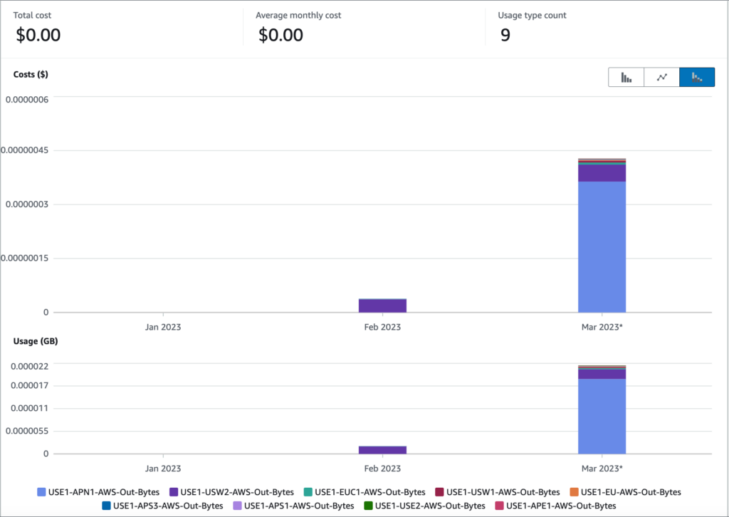
Unfortunately, I haven’t been running large EC2 data transfers in my spare time, so my graph looks fairly uneventful. But depending on your usage, these filter selections should give you a nice breakdown of your EC2 internal data transfer costs.
You can play around with other filters to isolate other costs. For instance, use the EC2: Data Transfer – Internet (Out) to see your outbound EC2 data transfer costs.
Visualizing AWS Data Transfer Costs Using CUR (Cost & Usage Reports)
Cost Explorer is great, but it does come with some limitations. It only lets you filter on higher-level data, and retains only 12 months of spending history.
In contrast, the CUR is a full record of your account’s entire spending history from the moment you enabled it (hence, enabling it early is key). While the CUR is a huge and complicated beast in its own right (refer here to our CUR guide), it does enable you to gain key insights into your spending. You can use the CUR alongside a native integration like Athena and Quicksight to produce some really pretty, really detailed graphs. It does require you to put in a little extra effort, but it’ll be well worth it!
Prerequisites for CUR Visualizations with QuickSight
We’ll be loosely following the steps outlined by this AWS blog post for this exercise. For the next few visualizations, you’ll need to do the following:
- Have the CUR enabled in your account. During setup, choose to include resource IDs. Also, make sure you choose Athena as your integration. Check out this article for a more in-depth exploration of the CUR-Athena integration.
- Sign up for QuickSight in your AWS account, and ensure you give QuickSight access to Athena as well as the S3 buckets with your CUR reports.
After you finish these two steps, go to the Athena console and run the following query. This generates a view that will be useful in helping us build visualizations from a focused subset of data from our CUR. Remember to replace aws_billing_report.my_cur_report with the name of your Athena table.
CREATE OR REPLACE VIEW data_transfer_usage AS
SELECT DISTINCT
  bill_billing_period_start_date
, line_item_usage_account_id
, line_item_product_code
, line_item_line_item_type
, line_item_operation
, line_item_line_item_description
, line_item_usage_type
, line_item_resource_id
, product_product_name
, product_region
, product_from_location
, product_to_location
, sum((line_item_usage_amount) / 1024) "TB"
, sum(line_item_blended_cost) "cost"
FROM
  aws_billing_report.my_cur_report
WHERE ((((line_item_usage_type LIKE '%Bytes%') AND ((((line_item_usage_type LIKE '%In%') OR (line_item_usage_type LIKE '%Out%')) OR (line_item_usage_type LIKE 'Nat%')) OR (line_item_usage_type LIKE '%Regional%'))) AND ((product_from_location = '') OR (product_from_location LIKE '%(%'))))
GROUP BY  bill_billing_period_start_date, line_item_usage_account_id, line_item_product_code, line_item_line_item_type, line_item_operation, line_item_line_item_description, line_item_usage_type, line_item_resource_id, product_product_name, product_region, product_from_location, product_to_location
After running this query, you should see data_transfer_usage show up as a view in Athena.
Next, head over to QuickSight. Under DataSets, create a new Data Set from Athena. For Data source name, enter data_transfer_usage. In the next pop-up screen, for Table, select the data_transfer_usage you created in Athena. You can keep all other default settings, and then choose Visualize.
Once you’re taken to the main QuickSight dashboard, you should see that your view is loaded and all your columns are ready to be dragged and dropped into graphs. Let’s build some visualizations!
Combo Chart: Costs & Usage in One
First, let’s make a combo chart, which is useful for simultaneously visualizing both costs (via a bar graph) and usage (via a line graph). In QuickSight, create a new visualization, and choose the combo chart. Use the following fields:
- X axis – bill_billing_period_start_date (MONTH)
- Bars – cost (SUM)
- Group/Color for bars – line_item_usage_type
- Lines – tb (SUM)
This produces a visualization that looks like this:
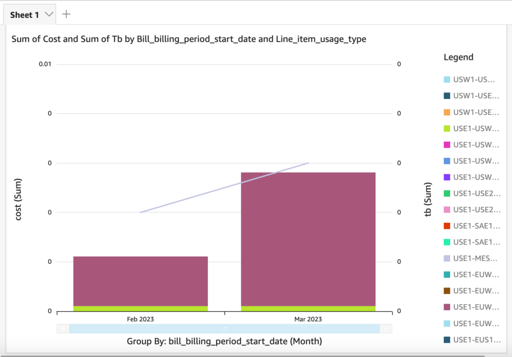
Your graph will look better with more spending data. After letting your CUR accumulate spending data over a few months, you should be able to see trends in your spending. For this particular visualization, it can be very useful to use a filter to exclude data type combos to not overcrowd the legend.
Box Plot: Min, Max, and Average Spend
Next, let’s make a box plot. The box and whisker plot that you might vaguely remember from elementary school is actually an excellent tool for visualizing minimum, maximum, and average spend range for particular usage types. To create this visualization, use the following fields:
- Group by – line_item_usage_type
- Value – cost (tb works too if you want to track usage)
This produces a visualization that looks like this:
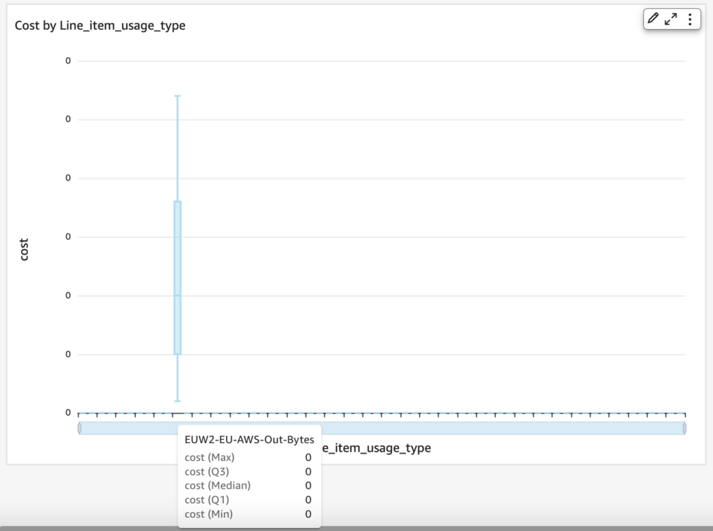
A box and whisker plot shows you the minimum and maximum (how far the “whiskers” extend), as well as the typical range of spend (the box). This graph is all zeroes due to low usage, but you can see how a box plot can be very useful in showing you the cost range of a particular usage type. If you hover over the graph or x-axis area, you can see specific numbers for the minimum, maximum, median, first quartile, and third quartile.
To trim down the number of x-axis values, add a filter (i.e. focus only on the -AWS-Out-Bytes types).
Donut Chart: Resource IDs Contributing To Spend
Finally, let’s make a donut chart, which will help us determine which one of our EC2 instances are contributing most to our spend. We will use EC2 instances in this example, but you can use this for any resource in your CUR (hence why you should include resource IDs in your CUR). Use the following fields:
- Group/Color – line_item_resource_id
- Value – tb (Sum) (You can also use cost to track costs)
This produces the following visualization:
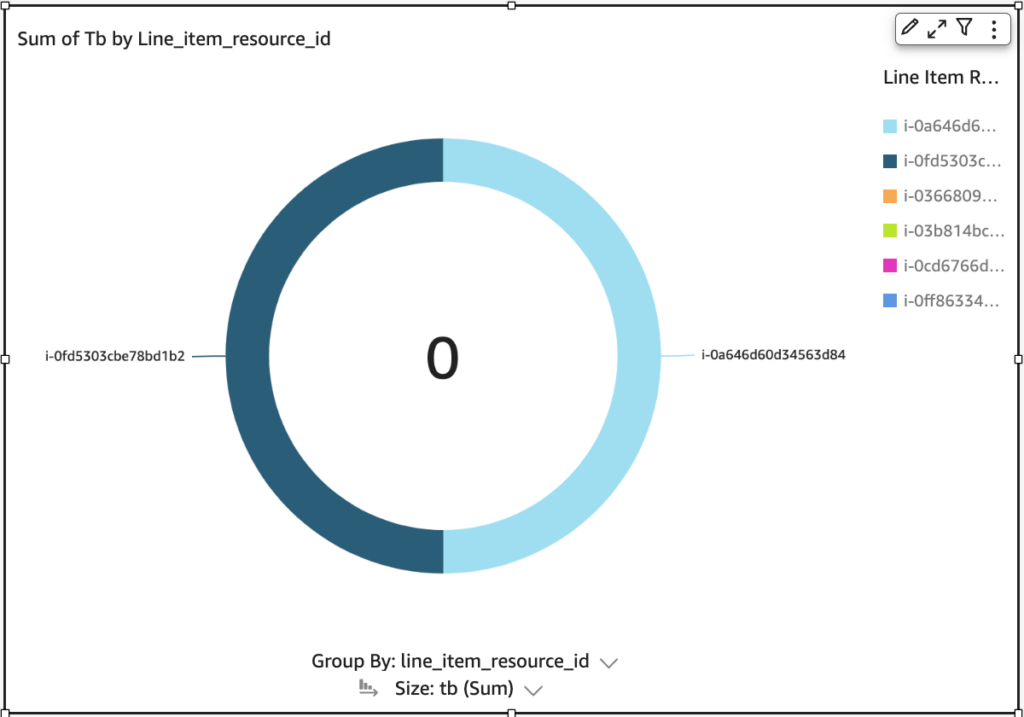
This tiny AWS account only has 2 instances with some usage, so the resulting pie chart is very dull. Again, with more usage data, you’ll be able to produce cooler-looking graphs.
Conclusion
Don’t let your data transfer costs fly under the radar! By visualizing data transfer costs using Cost Explorer and CUR, your business can gain a better understanding of spending patterns and identify areas for cost optimization. In this article, we focused on using these tools to examine inbound, outbound, and internal data transfer costs for EC2 instances, and suggested three types of graphs in QuickSight perfect for visualizing cost and usage data.
As a next step, we highly encourage you to jump into your AWS account and play with these visualizations. Alternatively, give CloudForecast a spin. CloudForecast can provide daily AWS Cost Management Reports with similar visualizations so you’re always on top of your AWS spend.
Manage, track, and report your AWS spending in seconds — not hours
CloudForecast’s focused daily AWS cost monitoring reports to help busy engineering teams understand their AWS costs, rapidly respond to any overspends, and promote opportunities to save costs.
Monitor & Manage AWS Cost in Seconds — Not Hours
CloudForecast makes the tedious work of AWS cost monitoring less tedious.
AWS cost management is easy with CloudForecast
We would love to learn more about the problems you are facing around AWS cost. Connect with us directly and we’ll schedule a time to chat!
